Thursday, March 24, 2011

I Love Me Some Silhouette


So, I, like every other woman that has read any crafting sort of blog, became very envious of the Silhouette owners. I WANTED one, and I was pretty sure I NEEDED one. There were so many cool projects that I would just never be able to do. I had used a friend’s Cricut once...wasn’t too impressed. Sorry-not trying to dog the Cricut owners, but I wanted to be able to use my own fonts, and images, and I DEFINITELY didn’t want to have to buy a zillion cartridges.

Then at Thanksgiving, just about every blog and their dog’s blog was posting a Silhouette giveaway. I entered every.single.one. with every.single.possible.way. I lost track, but let me tell you I spent a whole Saturday trying to enter them all, and I had a chart to keep track, so I didn’t double enter. Yeah, I really wanted one.

Is it any surprise that I didn’t win, considering that every other woman wants one too? No, but I really had my hopes up. SO I begged my husband to get me one for Christmas. He said he had another idea. My husband isn’t the surprising type. When he says “he has another idea,” that means he really does have another idea, and you’re probably not going to get it.

Thanks to my in-laws who happened to be getting “the other idea” for us for Christmas, he was left with no other option but to get me the Silhouette. And oh, what a happy surprise it was.

I decided to bust out a vinyl project first.vinyl-bon appetit

I bought this platter at Wal-Mart in their post-Thanksgiving sales for around $6. I got online and looked at free fonts, and eventually came up with this one. I gotta be honest-this wasn’t the easiest first project, but it did help me to learn the workings of the Silhouette software better. I never did figure out how to do an accent on the top of the “e.” What I did was use an apostrophe, move it above the “e,” and then rotate it. I also cut off the bottom of the “p” because it was longer than I liked it.

It also took me a couple of cuts to get the settings on the machine right. Again, not the easiest first project. There are some REALLY thin cuts with this particular font. But I eventually got it all figured out, and am quite happy with the results.

This next project was MUCH easier. The hardest part was coming up with a font. Whenever you have guests over, people tend to get the trash/recycling confused, so why not label them? Easy peasy.

vinyl on trash cans

Please ignore my mis-matched trash cans. When I bought the first one on the right, we were in a small house and only had room for one trash can, so recycling piled up on the kitchen counter until we took it outside (ugh. I hate piles on the counter). Once we bought this house, I searched and searched for the same one to match. No such luck, they don’t make them anymore. The one on the left was the closest match I could find. Ideally I would just buy two new ones so they both match, but these suckers ain’t cheap. So there’s my story of the mismatched garbage cans.

Miss Silhouette is making all of my wildest dreams come true. Okay, not really, but I do love having her around. Next up is to try the new fabric interfacing. That opens some awesome new doors.

Confessions of a Not-So-Super Mom


Every mom feels a little bit better when she realizes that there are other not-so-perfect moms out there. So here is my confession of the day:

Sometimes Little One cries when she sees me heading toward the computer. Sad, huh? She knows as soon as I hit the computer, she suddenly gets less than 100% of my attention. You people gotta stop coming up with so many amazing ideas that I feel like I can’t live without.

It is so hard to balance being a mommy, keeping house, feeding your family, and still feel like you accomplish some of the things that YOU want to do. I don’t know how working moms, and especially single moms do it. Props to you.

Sometimes I need to step back and remember what is most important, and that is this sweet little face: 2011 1-23 Shayla bday cake 36 copy

She’s not going to be this little much longer. My projects will eventually get done...they just take a whole lot more time than I ever think they will. So be patient with me when I slack. I’m putting the Little One first. :)

Tuesday, March 22, 2011

From drab to fab

Campbell guest bath

This is it peeps. This is all I have for a “before” picture. Can you see through the doorway there? Just a little bit? That’s our living room. Yep, the smarty pants builders put a bathroom right off of the living room. You’ve got guests over, someone has to use the restroom, and everyone else gets to hear it. Awesome. Also, we all know how often bathroom doors get left open. So, since you can see directly into the bathroom from the couch, it needs to look nice. It also needs to match the living room decor.

What you can’t see in this picture, is the space to the left of the toilet. One of the builder options was to put a bath/shower in to make this a full bath. The lovely people who built the home opted not to do that, which means there is a huge empty space where a bath tub should be. Luckily we have enough full baths in this home, so we’re not even going to go there. But we definitely need to fill the space a little.

So let’s get going, shall we? First we started off with a coat of paint. Can I tell you how difficult it is to paint around all of those pipes behind a pedestal sink? Difficult. My lovely husband took out the toilet for me, so that process was not as tricky. It would have helped had I primed it first, since the builders used icky glossy paint (what’s the point when there’s no bath?). Anyway the paint just smeared and slid around all over. Plus the lighting isn’t so great, so I kept having to go back and touch up spots.

Fast forward a couple months: we FINALLY get around to adding the molding. This part went fairly quickly, as we had done this in the living room previously (reveal to come later). Everything I know about molding, I learned from Sarah, Miss Thrifty Decor Chick. I can’t am too lazy to point you to a specific post, but if you spend even 5 minutes on her blog, you will be sure to find at least one of her many molding projects.

OK? So would you like to see the finished product already? Alrighty then. Just a word of warning. My camera is lame-o, as in LAME with a capital L. That, and the bathroom is too small to get it all, and the lighting isn’t too wonderful either. OK. Here she is: 100_3747

100_3748

What you can’t see here, is that there are actually 4 columns on the left wall. Hopefully you get the gist. 100_3743

100_3746

100_3742

I chose not to put boxes on the right wall, because it would get tricky with the toilet and the sink. See what I mean about that huge space back there? That back right corner is still begging for something. I’m planning on getting some sort of little bench to put there when I find the right one.

100_3744Campbell guest bath

Here is the best before/after shot. Well, it’s actually AFTEr/BEFORE, since I can’t seem to get them to trade places.Too bad you can’t see any of the molding. Do you see in the before picture how the doofi (that’s plural for doofus, you know) put the towel holder in pretty much the worst spot ever? Not to mention it was crooked and shiny. When you hang a towel there, it covers up the light switches. Brilliant. I bought a new one that matched the other hardware in the room, and we moved it to a more efficient place. 

100_3745

As you can see, we still have ugly light fixtures and boring builder mirrors that need to be replaced or framed. That will come in time friends, in time.

So there you have it. The first “reveal” of our remodeling/decorating efforts. Much more to come. We are finally starting to get some of the projects completed.


image


Friday, March 18, 2011

Introductions

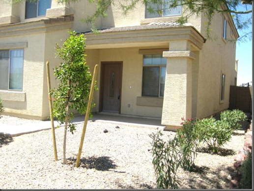
My lady here, she’s a little shy and embarrassed to be introduced to you in all her nekkedness. Be kind. These pics were all taken pre-purchase and the extreme makeover had not begun. Unfortunately, I can be a little harsh on my lady. I’ll try to keep the criticism to a minimum so as not to hurt too many feelings. Here she is, the lady we call home.4418643_P01

4418643_P02

Can you tell what part of the country we live in by the landscaping? I much prefer grass, but this will do for now. The front porch begs for some sort of seating. The door could use some paint as well. You can see exactly where the sun shines on it, and which part always stays shaded.

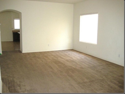
Open the door and come in friends.4418643_P11Here we are in the living/dining area. I’ve got a finished product coming up soon, so I won’t go in to much detail here. You see the kitchen through the archway.

Campbell living room 2

As you step in, and look to your left, this is what you will find. The archway to the left that you can’t really see--that goes to the “media room,” which we so affectionately call our office. As you go down the little hallway, there is the laundry room on the left, and a closet underneath the staircase.

Campbell laundry

Looky! There’s a hookup for a sink! I didn’t think that was a priority, but now that we’ve been here several months, I’m kinda starting to get antsy to get this room a little more functional. That one shelf just isn’t cutting it. I’m thinking some cabinets. Definitely a sink. Maybe some board and batten or beadboard if I can convince the hubby.Campbell office

The little hallway into the office. I’ll show you a better view of this room as we work our way around. Laundry on the left, closet on the right.

4418643_P10 This picture is taken standing by the stairs, facing the front door. Duh. Sorry, but I had to state the obvious there, just in case. That archway to the right is the guest bath. I won’t show you now, because that reveal is coming up next. You can’t see it, but there is a door in between the arch and the front door. That is “supposed” to be the office. It is currently our construction staging area, but is supposed to someday become my massage room.

4418643_P03 Let’s move into the kitchen now, shall we? I LOVE my huge island. I DO NOT love the ugly laminate counter tops. I LOVE all of the cabinets/mass storage space. I DO NOT love the wire shelving in my pantry (the door on the right). Hubby promised we could get granite countertops put in before we moved in. Then our closing date got pushed back so far, we had to move in right away. Then we got the quote, and now hubby says I have to wait. Boo-hoo. I am trying to be oh-so patient. It would really look so much more beautiful with non-ugly counters. I’m thinking there might be some beadboard that will happen along the outside edge of the island as well. I could think of a few other things I would like to do in here, but we won’t go there now since they would be too expensive and probably won’t ever happen. Now turn around.

4418643_P07This is the dining area and family room. The arcadia doors go out to the backyard. Those doors to the left go to the office/media room.

Campbell kitchen Here is another view of the whole room. It is BIG. Almost too big really. I wanted a kitchen that would open up to the family room, so that everyone would be together with family gatherings. It definitely works for that.

See my hubby and baby there with Miss Realtor? Another sidenote: can you see there by the window furthest right, how there’s a line where the paint gets darker? It’s all the same boring builder creamy white, but to the left is flat paint, and to the right gloss. It’s totally obvious and so tacky.

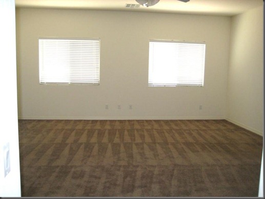
We’re heading through the double doors into the office.4418643_P08

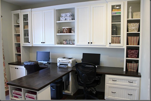
This view is taken from the hallway I showed you before. The doors to the family room are on the right wall, and the door to the garage is on the far left. It is just one big, boring room with no storage. I envision something like this that Miss Sandra built:image

Isn’t it beautiful? Not sure my husband or I have the talent or patience to build that, but I guarantee we can’t afford to buy something like that. Sandra is Superwoman. I am not, but I am trying. We did buy some bookshelves to make-do for now, but I eventually would like to have some cabinets built in for storage as well.

Ok folks. That’s it for the downstairs. Let’s head upstairs, and get some sleep eye. We’ll come back for the upstairs tour in a few...

Campbell stairs 1

Thursday, March 17, 2011

Welcome

I thought I’d take a few minutes and tell you a little bit about myself. A little over a year ago, my husband and I welcomed this precious little girl into our lives. IMG_0701

I quit my job as a massage therapist at a physical therapy clinic, and became a full time mommy. In between (and often during) the many hours spent feeding a newborn, I discovered the world of blogging.

Oh, I had seen blogs of friends & family, but I had yet to realize how much I could learn and be inspired by all of the blogs out there. I found a couple favorite blogs, and spent hours catching up on every. single. post. Hours I tell you.

My very favorites were the decorating and crafty type blogs, but we had already maxed out any and all space/storage room in the house. So, even though the wheels were spinning about all the cool things I could do to my home, they had to be put on hold until we knew where we were going to be living long term. Lucky for me, we soon began searching for a new home. After several months of searching, and then months of trying to close due to some serious issues with the mortgage company, we finally moved into our home sweet home.

Since then, we have spent hours and hours, and more money than we would like to think about, trying to make our home “ours.”

Here I will share with you the adventures of turning a house into a home. The adventures of a mom who is learning how to deal with an independent little girl. The adventures of a woman who wants to learn and be good at everything, but hardly comes close.

It’s a good life. There’s a lot to learn, a lot to do, and not enough time.  Welcome to this piece of my life.